Our Kids' Climate
Brand Guide
Welcome to the Our Kids' Climate brand. Use this guide to understand how to use key visual elements, and how to write in our style.
Brand Story
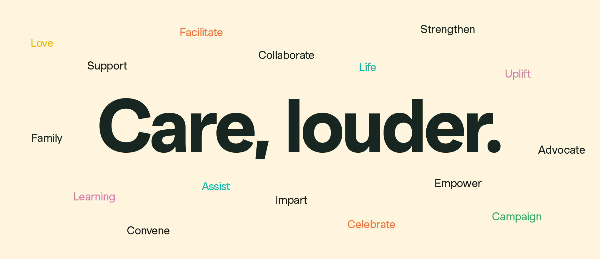
Our story is encapsulated in the idea of 'Care, louder.'
This represents the dichotomy at the core of our brand, between Love and Action, Community and Advocacy, Convening and Uplifting.
This is the idea at the foundation of our brand, to be used as a starting point for anyone creating and communicating on our behalf.
Tone of Voice
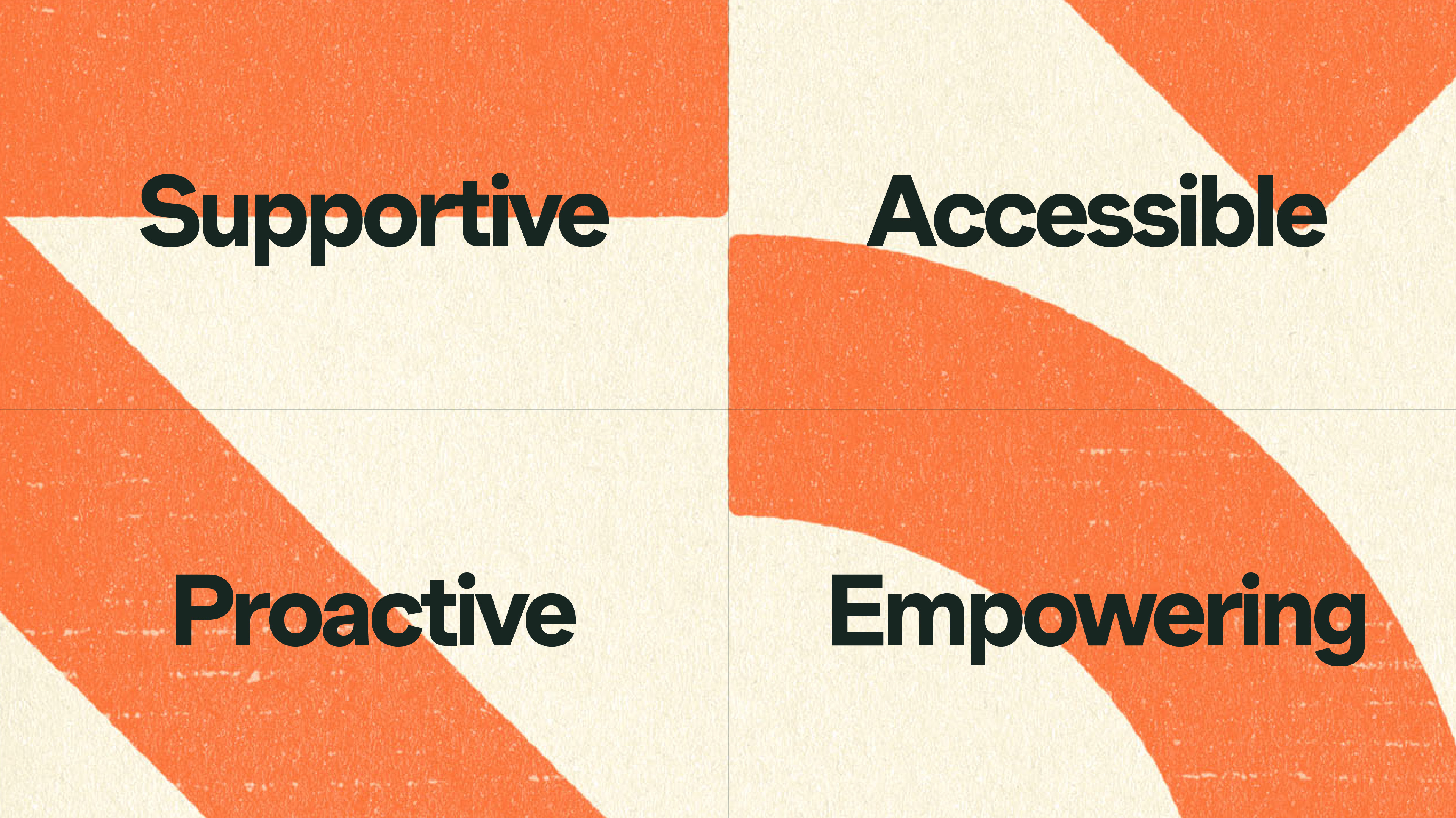
Our tone of voice principles help guide how we communicate to our audience. In summary they hold a creative tension between inviting and supporting our community, and empowering our members to organise and take action.
Supportive
Holding and nurturing conversation and ideas by prioritising our community in our writing
Accessible
Welcoming all cultures, with language that’s easy to understand
Proactive
Presenting tangible action with enthusiasm
Empowering
Showing unbridled confidence in the people that make our movement.
Messaging
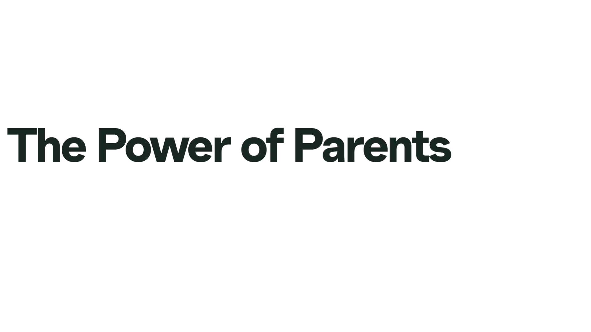
Our core message is "The Power of Parents."
This is the starting point for our communications: the key concept that makes Our Kids' Climate and our network of parent-led grassroots organisations unique within the climate movement.
We also know that our network is broader than just parents, and we can widen the scope of the word by including alternatives as shown below.
For more detailed messaging guidance and inspiration, read our Messaging Guide doc.
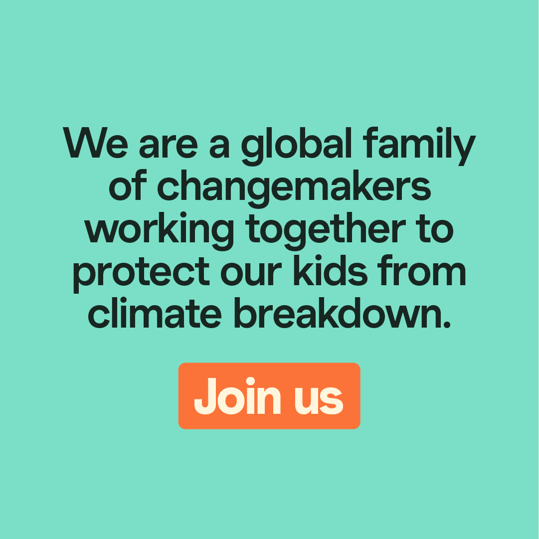
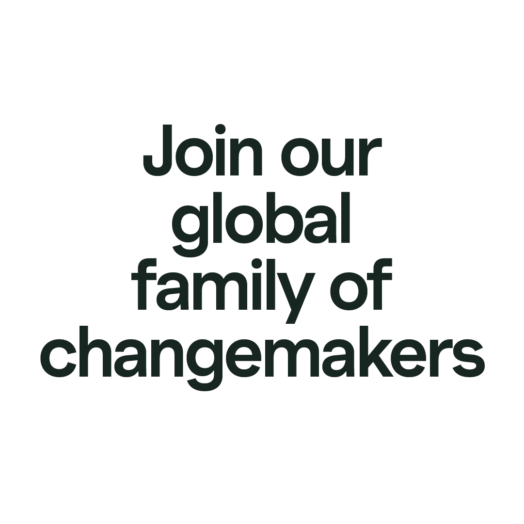
"Our global family of changemakers" is how we refer to our network of organisations, communities and leaders.
As shown above, this phrase can be used in a short headline or with extra context. It's a proactive and inclusive phrase designed to motivate our audience to get involved.
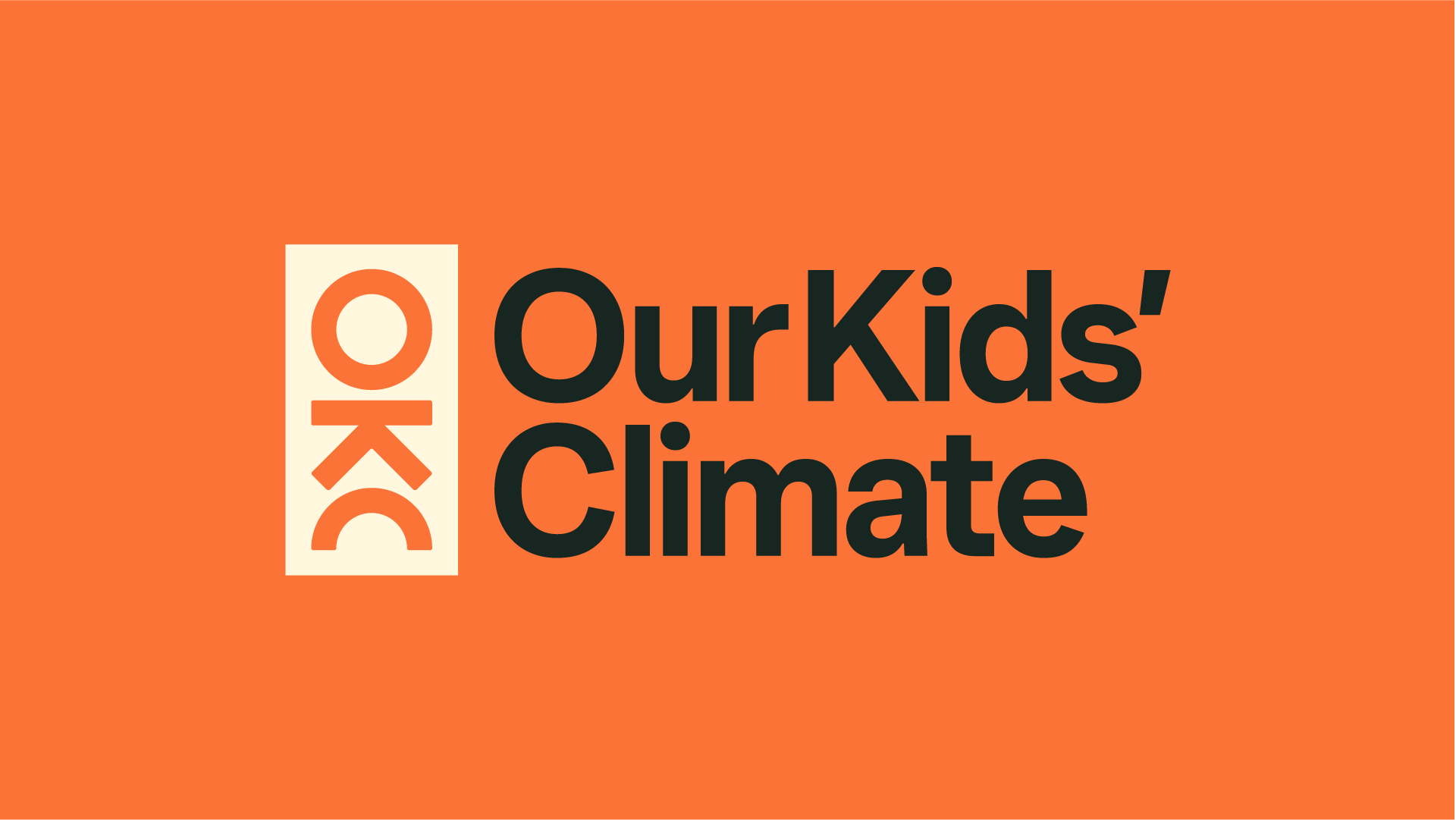
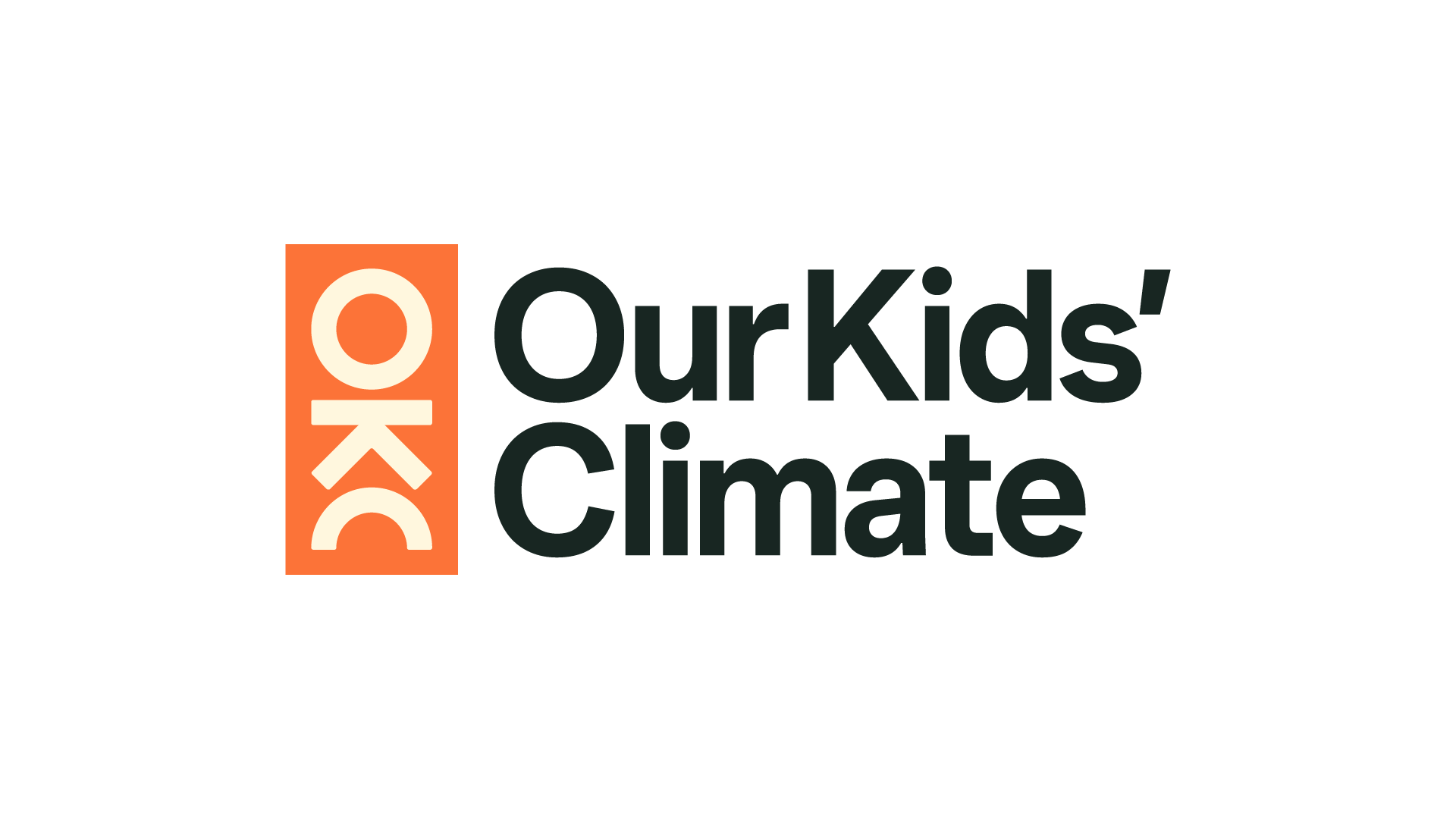
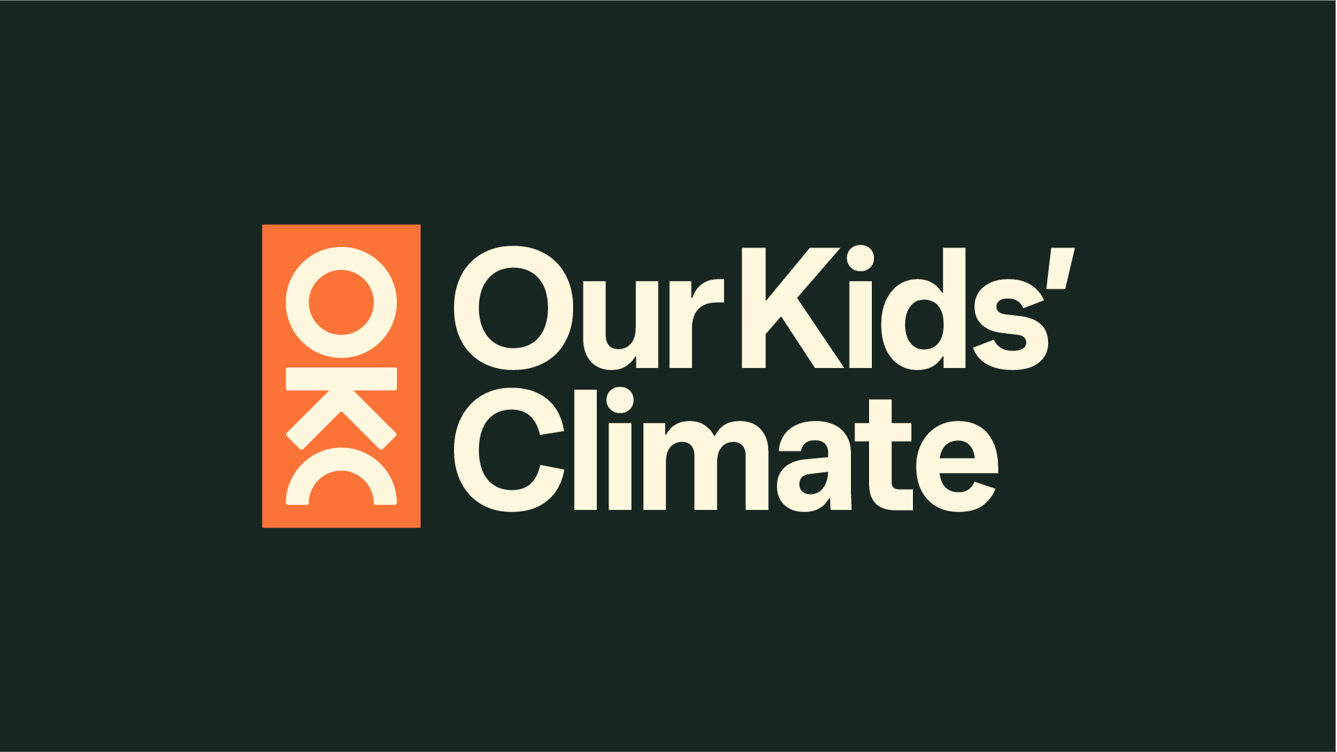
Logo
The Our Kids' Climate logo is created from the initials of our name, rotated to resemble the figure of a child jumping over a horizon line. It's unique proportions and construction help communicate the joy of our movement and represents what we our protecting.
The orange tab visually contains and protects the joyful optimism of the symbol, while the logotype is defined by a bold, direct font that conveys strength and consistency.
Our logo is available in different colours for use on different backgrounds, as well as pure black and white for the rare occasion these may be required or requested.
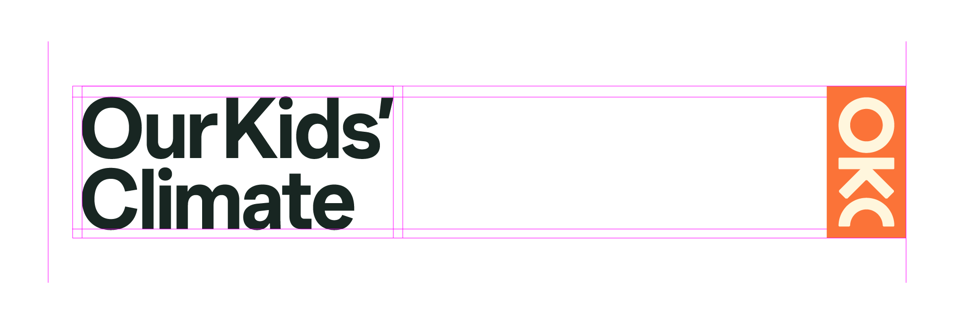
When using the logo in its main lockup, make sure not to stretch, squish, rotate, recreate or alter it in any way, and use it only as provided.
Make sure to allow enough space around the logo so that it is not crowded. You can use the width of the orange tab as a rough guide, but there's no hard-and-fast rule.
Position & placement
Our logo can be used in the traditional position—in the corner of a layout—and it can also be used as a tab, aligned to the left edge of the layout. The logo lockup can also be separated, placing the tab on the right edge, while the logotype can sit in the traditional position. Below are some examples:
Separating the logo
When using the separate logo elements (tab and logotype), ensure the height of both files are the same, as illustrated below.
While the tab element can be used on its own (for example on social media posts), the logotype should never be seen without the tab element also being used, whether as a lockup or separately.
Hero symbol
Our logo symbol doesn't always need to be contained. In some, more expressive applications it can be used as a hero element, for example in the endframe of a video, as shown here.
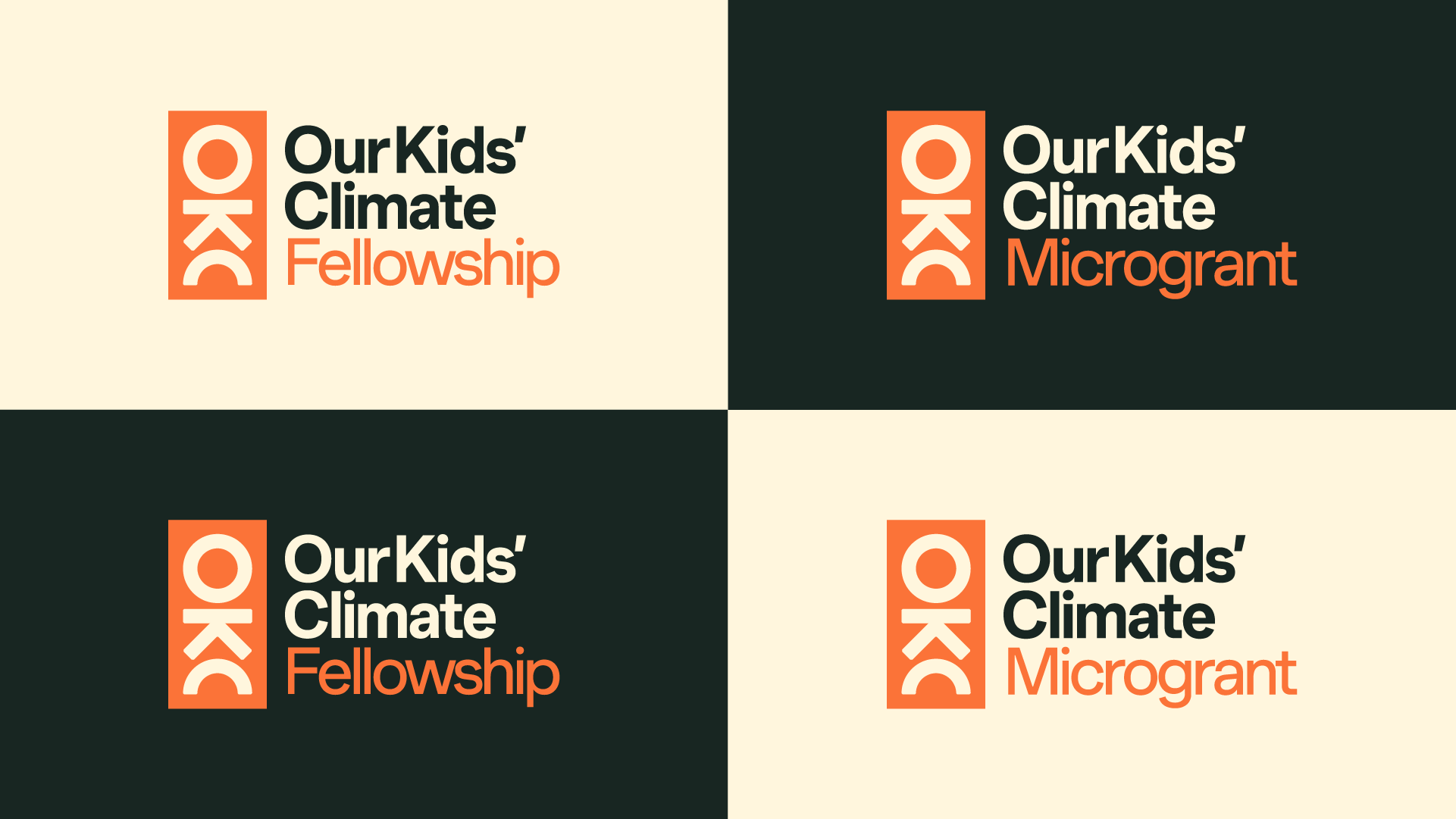
Certification logos
These logos can be provided to participants of our fellowship programme, and recipients of our microgrants.
Colours
Our core brand colours are Paper, Slate and Orange. These should be used for all primary and formal communications, such as landing pages, stationery and cover artwork.
Our secondary colour palette allows us to be more expressive. These can be used to highlight or categorise information, in illustrations and infographics, and they are used extensively in our background graphics (see graphics section below)
#FFF7DE
00-02-14-00 Slate
#182622
78-60-68-70 Orange
#FC7338
00-68-84-00
#14B8AF
74-02-40-00 Green
#39AB65
75-07-81-00 Yellow
#F4B614
05-30-100-00 Pink
#DB7AAB
10-64-05-00
#7adfc6
46-00-31-00 Light Green
#6fcb87
56-00-63-00 Light Yellow
#ffe14d
02-08-82-00 Light Pink
#f1a3cb
02-44-00-00
Typography
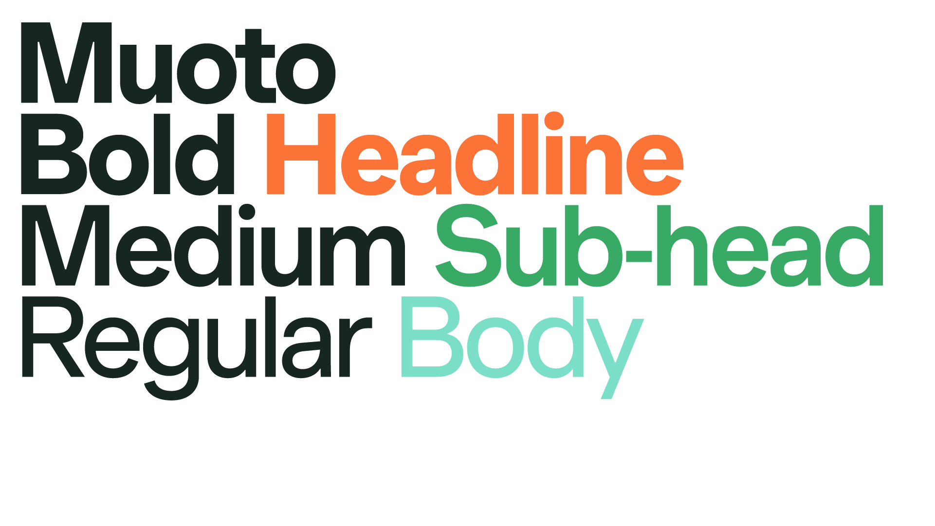
Our brand font is Muoto, from the foundry 205tf. It's been chosen specifically for its balance of clarity, humanity and impact.
Generally speaking, we use Bold for headlines, Medium for sub-headings and Regular for body copy.
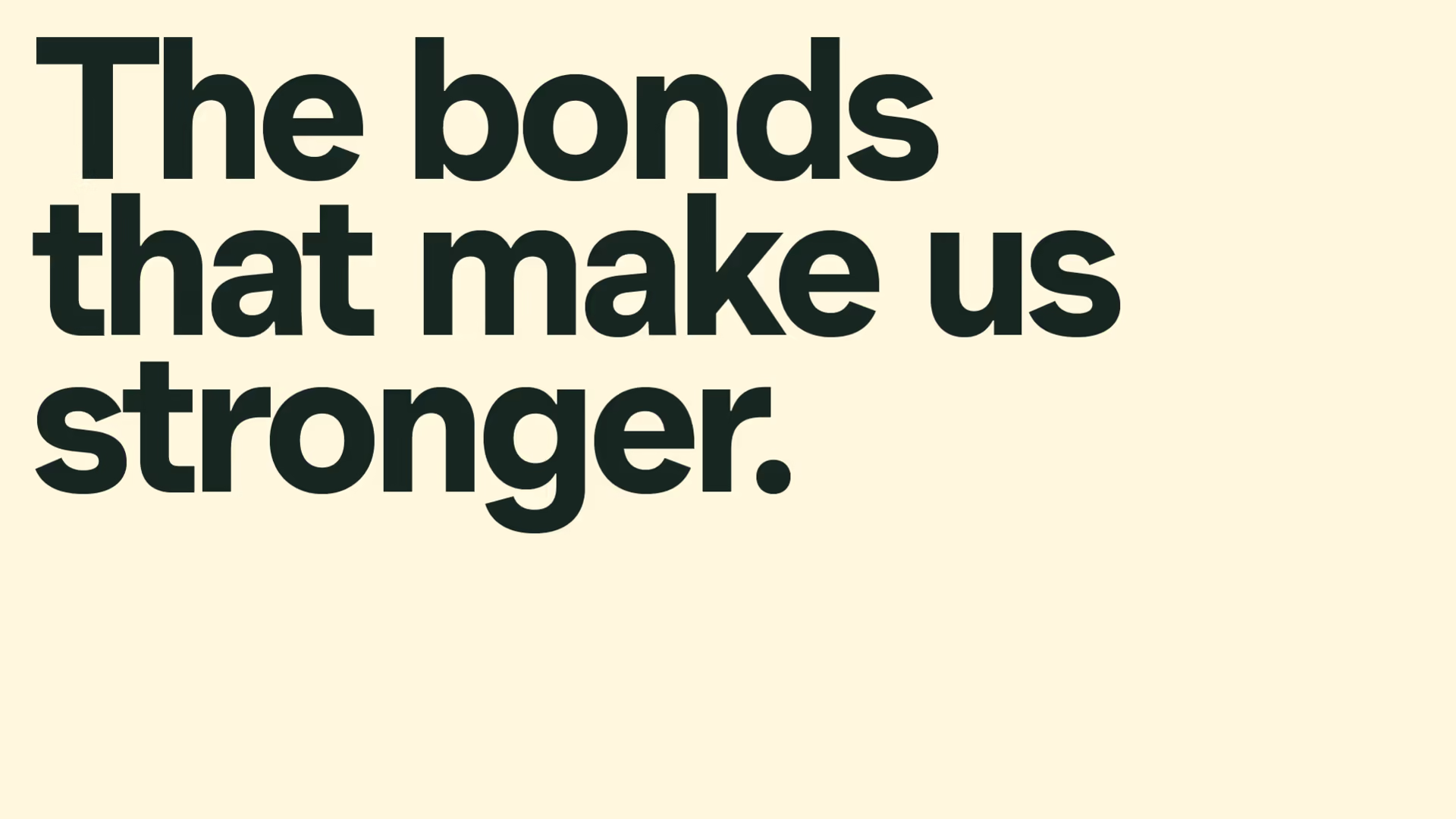
Headlines
Headlines should be big and bold, with tight leading (line-height) and close kerning (letter-spacing)
The examples above use 100pt type with 80pt leading, and -40 letter-spacing.
Google Docs
In cases where Muoto is not available, and it's not possible to upload or install it, we can generally use Helvetica Neue. Use the same approach as applied above to Muoto: Bold headlines with tight line-height, and Regular or 'Normal' for body copy.
Graphics
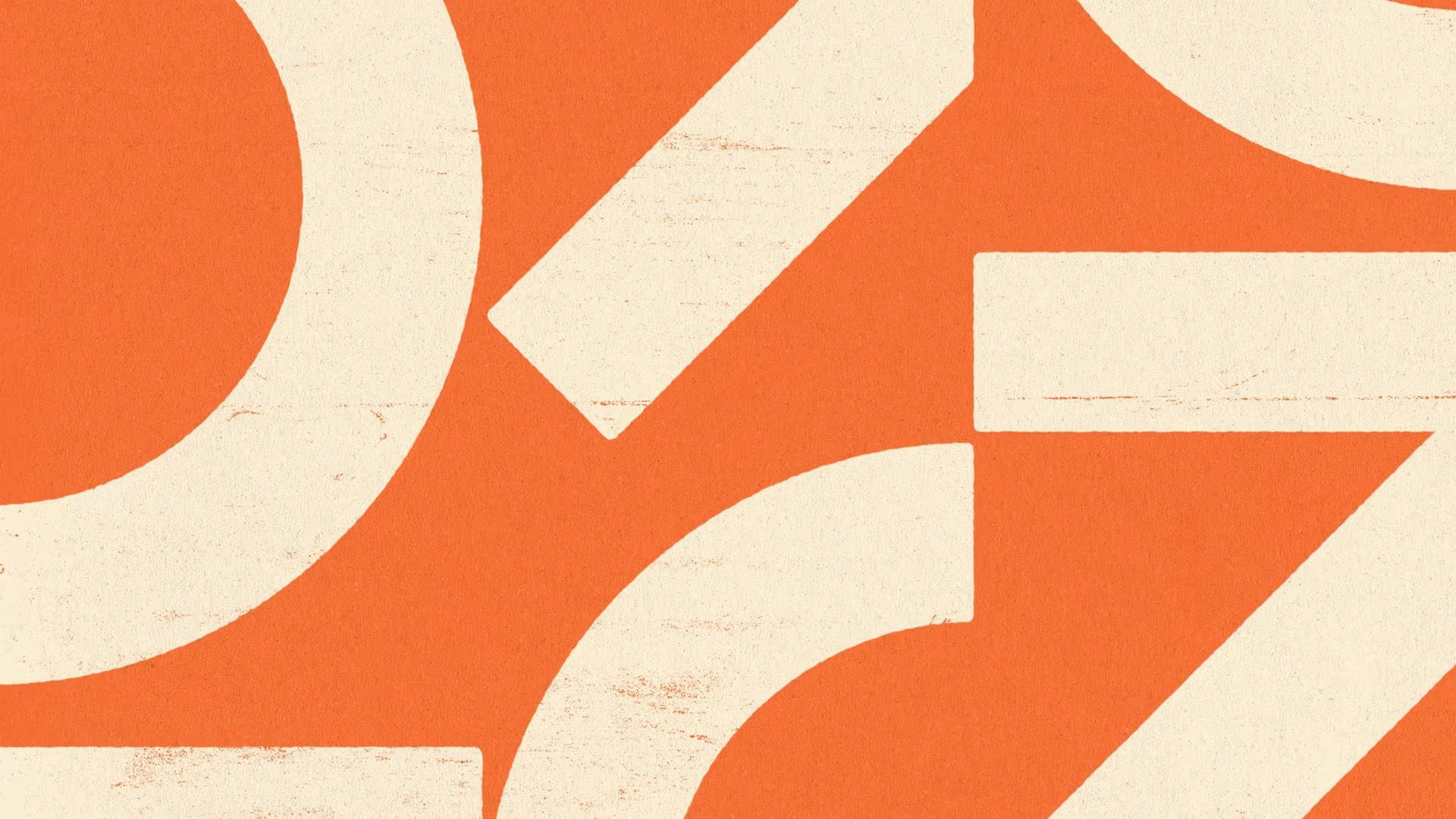
Our graphic backgrounds allow us to be expressive and colourful in our communications. They can be cropped closely for simple, bold layouts, or wide for expressive, dynamic patterns.
The full bank of patterns and textures can be found in the toolkit
Textures
Along with expressive patterns, we also have a set of one-colour textures. These can be used to add warmth and depth to a clean layout.


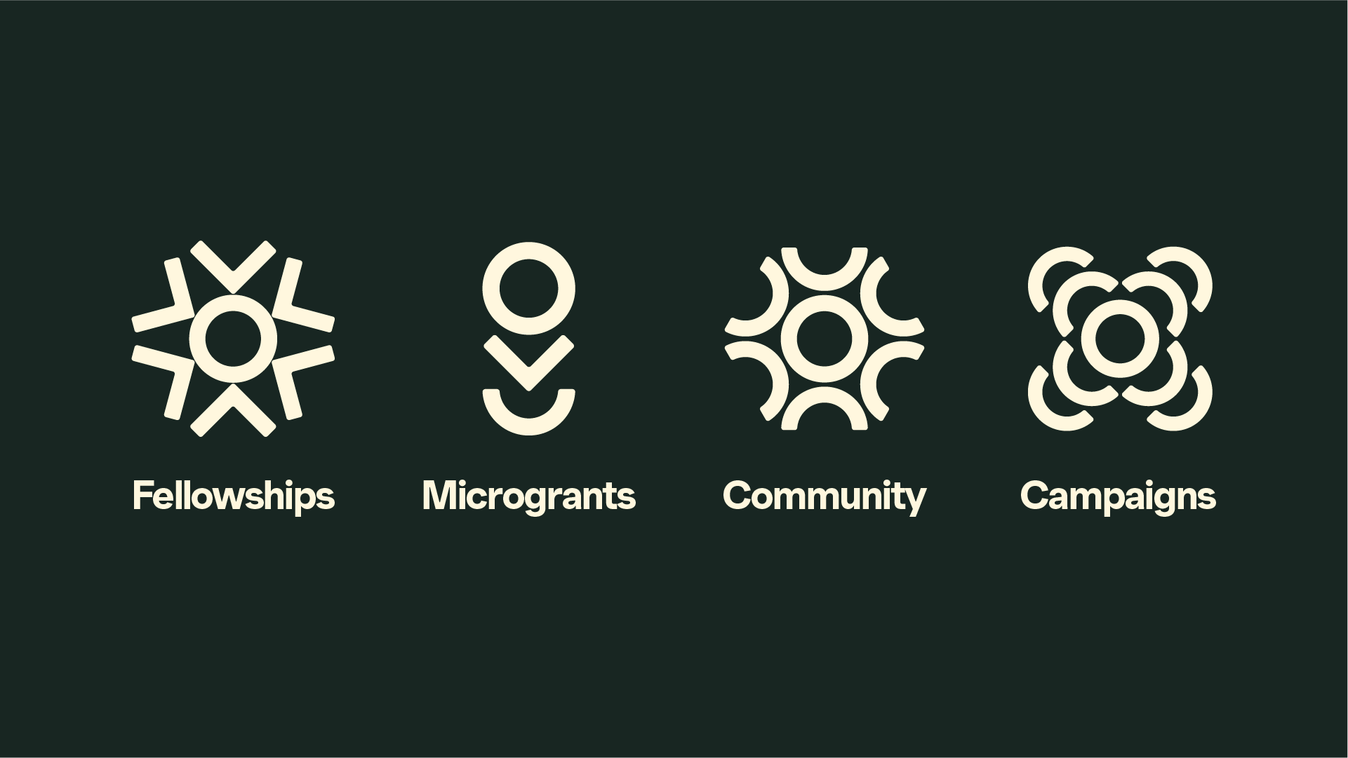
Icons
Derived from the shapes that create our logo, our icons help us communicate and categorise the different things we do. They can be used as markers to denote different information, or as larger expressions of our work.
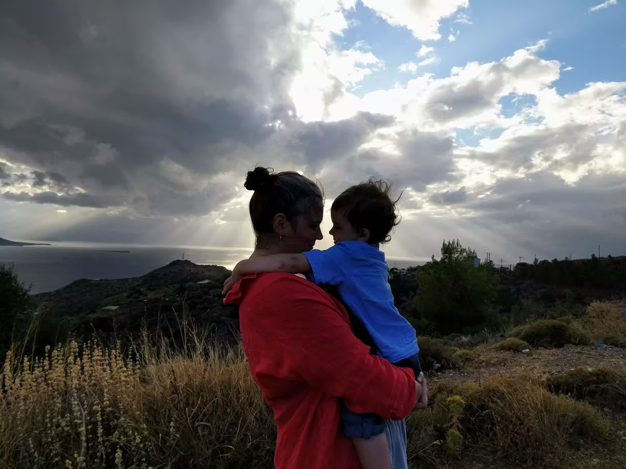
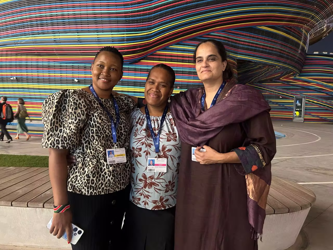
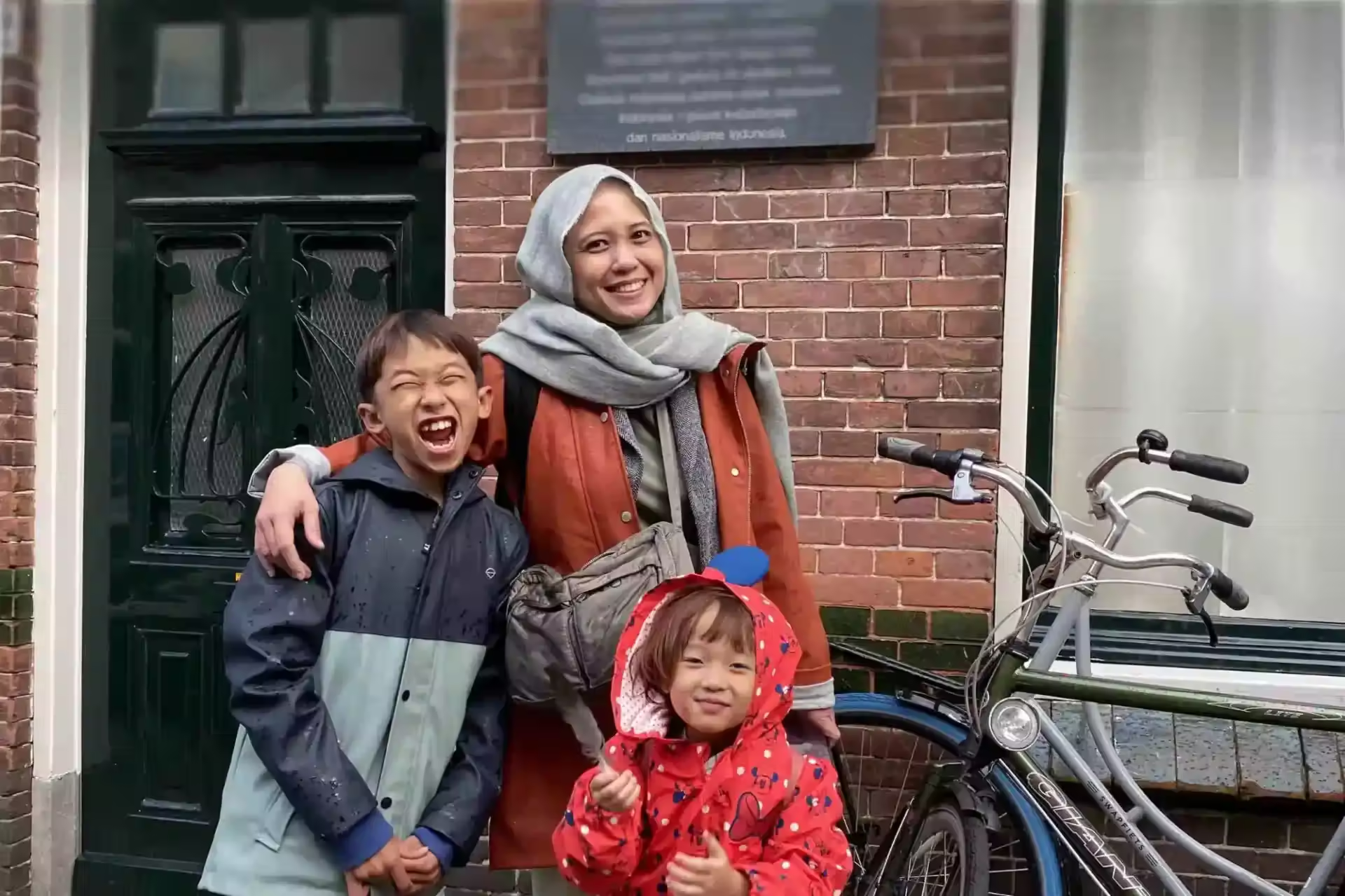
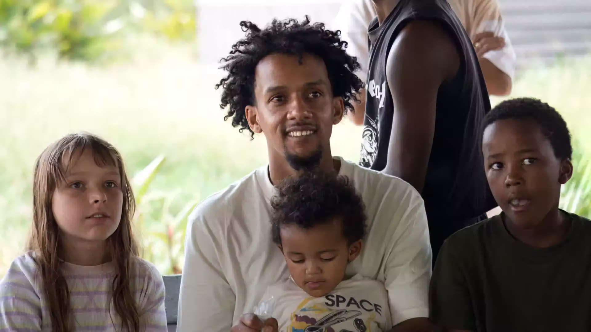
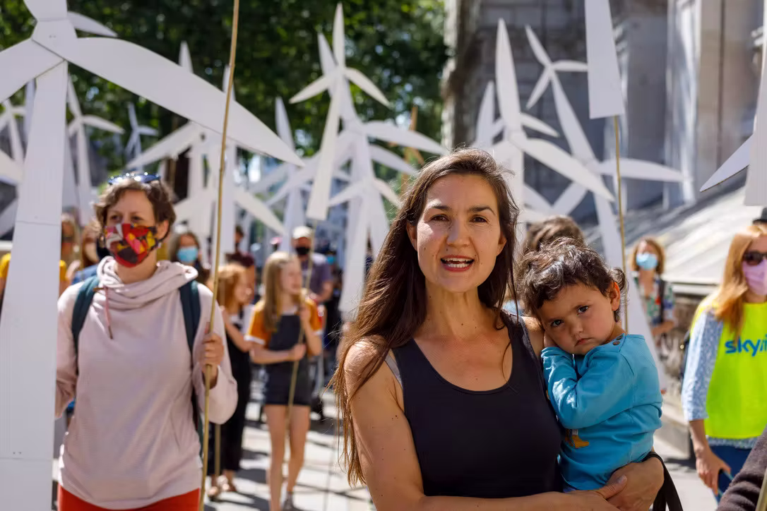
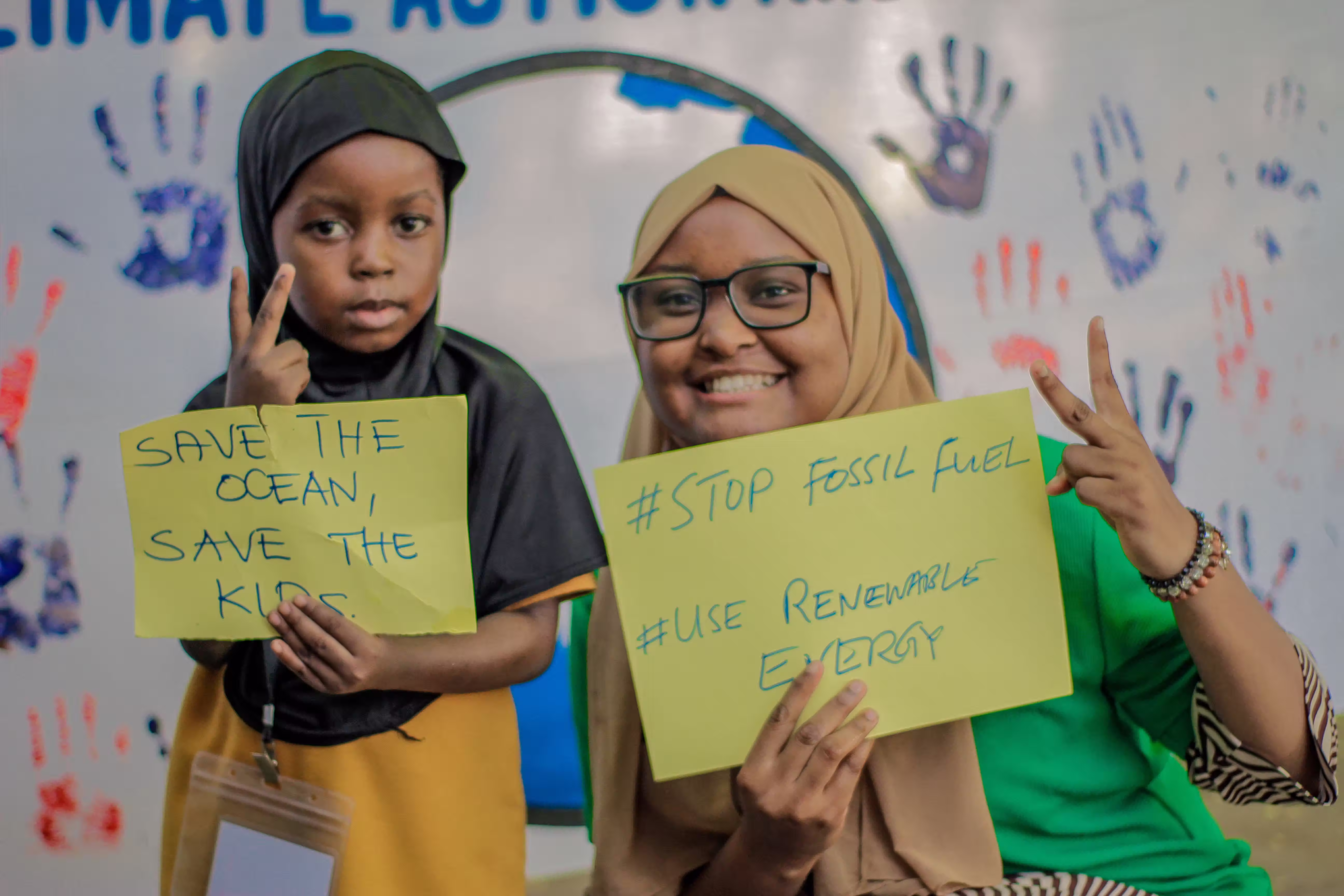
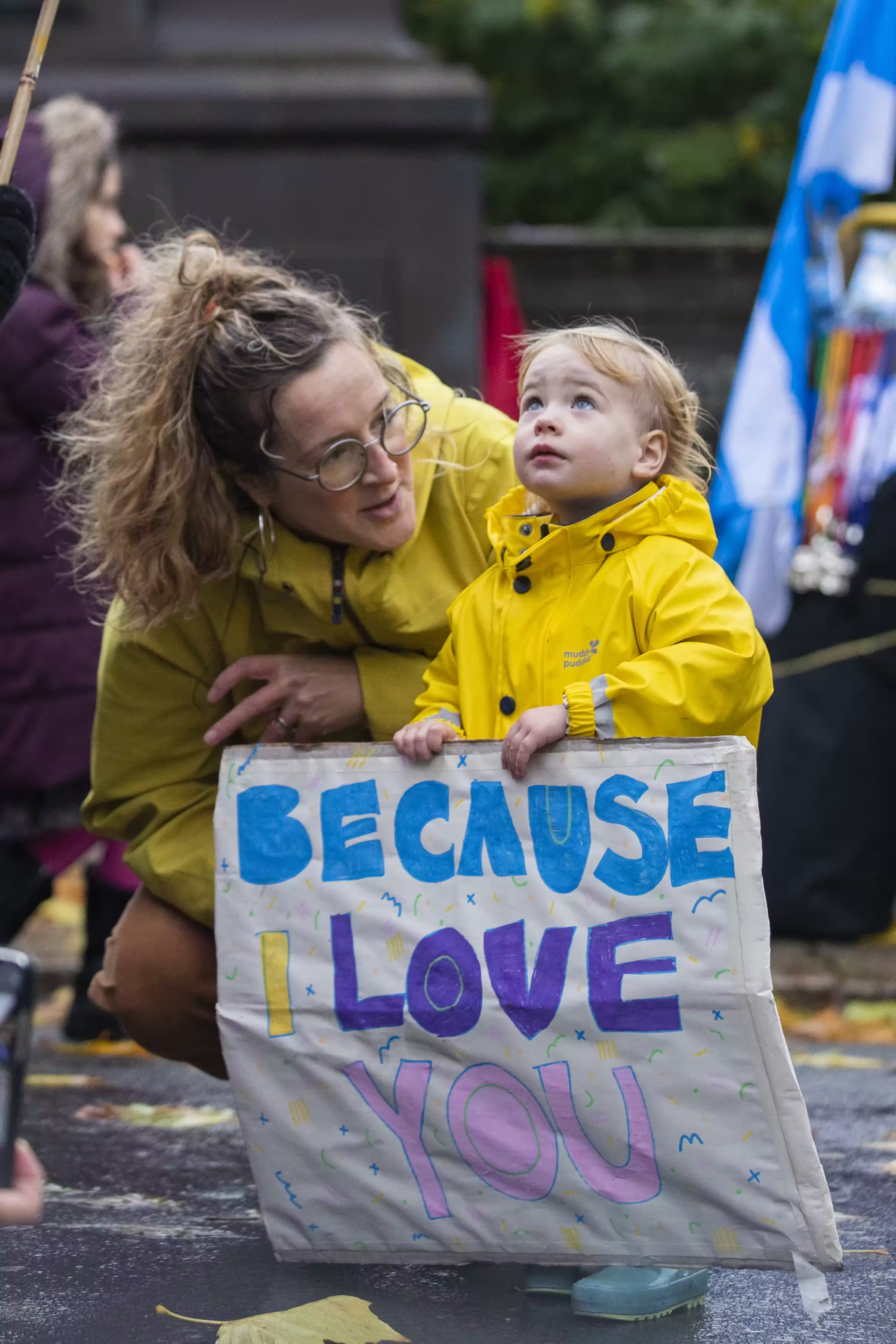
Images
We have a broad image bank of parents and community members from across our network. When choosing photos, always have in mind that we want to put forward a vibrant, welcoming community of diverse families.
Choose photos in which people are engaged and real, that don't feel too posed.
Use multiple photos in a layout to help communicate our diversity and global reach. Don't depend too much on images of protests or traditional activism, though these can be one element of a vibrant mix.
Examples
See some examples of how to bring the brand together below:
.avif)
Questions?
If you have any issues or questions about how to use our brand, don't hesitate to drop a note to hello@inprogress.studio
Created with inprogress.studio